

Lana Construction Company
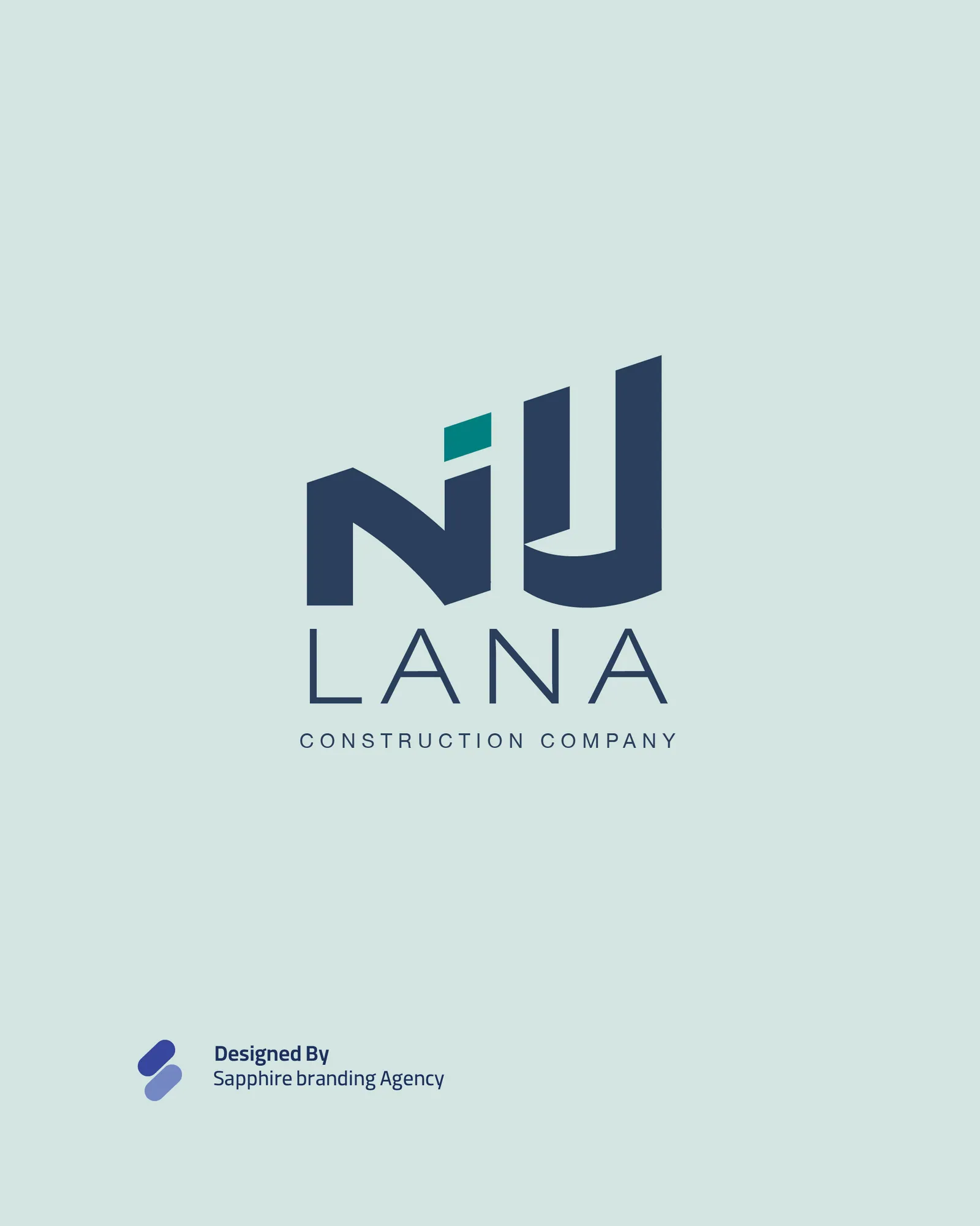
A confident identity for a Kabul construction company. The mark fuses the Latin and Dari letterforms of “Lana” into one architectural monogram, carried across stationery and a launch campaign.
 Nazim AfghanOwnerSenior Graphic Designer
Challenge
Lana needed an identity that could communicate both the strength of its construction work and the care behind its furnishing services. The challenge was to unite these capabilities in a distinctive brand that feels dependable, contemporary, and welcoming. What we did
What we did
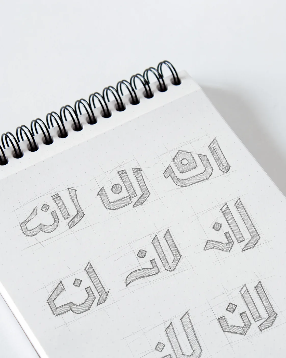
We explored the name through hand-drawn Dari and Latin letterforms, developing an architectural monogram with strong vertical lines and balanced proportions. A navy and teal palette, coordinated stationery, and creative social media designs extended the identity across the company’s communications.
Outcome
A cohesive visual identity that connects Lana’s construction and furnishing services. From business stationery to campaign visuals, the brand presents a consistent image built around structure, craftsmanship, and comfortable living.
The mark brings Dari and Latin letterforms together in a compact architectural composition. Its rising vertical forms suggest building and progress, while the connected shapes express the relationship between a well-built structure and a thoughtfully furnished space.
“Sapphire brought our construction and furnishing services together in one clear identity. From the logo to the campaign designs, the work reflects the strength, care, and attention to detail we want Lana to stand for.”
 Khairkhwa SahibChairman
We build brands that sell, not just look good.
Tell us about your business and we will propose the right mix of strategy, identity and media.